|
|
Post by Lejam on Jul 31, 2021 8:59:38 GMT -5
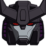
Attention to all members in this thread : What do you think about the heads, specially face sculpts ? This is a real survey. As mentioned previously, the heads and faces are the major turn-off for me. Not only do they look like they have these 'kamen rider scars' on the face, the proportion and placement of the eyes and nose and face shape don't look good, and doesn't give you the anime faces you expected. I personally don't particularly think they look like TF faces that much. They are just not very good faces, with a lot of distracting lines and details. Eyes too long and sits too high, got too much forehead when it doesn't need it...etc. Sentinel's Final Dancouga set has a 3rd extra non-transforming head that pay homage to Obari's drawing style (middle one in image). Now that is a great Dancouga head! Even the standard heads are very good, and the old SOC GX-13 has a great head sculpt, just the neck engineering sucks. But IMHO, I don't think the problem is only the heads. I think one of the shortcomings on this sculpt is easily shown in the separated robot group photo they posted. While their general body shape look less blocky than SOC and Sentinel's and in a way look more heroic, looking at the cougar and lion bots, you can't really make out of their main design shapes from the cartoon. There are a lot of chiseled shapes and unfamiliar angles, to a point it lost its identity. And with the high detail panel lining and weathering paintjob to pop them even more, the whole thing look very busy and unfamiliar. That group shot create a very busy mess with your eyes don't know where to go and can't make out of any Dancouga bot shapes we know and expect, and need to fall only on the mammoth bot chest as that is the only Dancouga bits left. Losing the color cues, I would have no idea who those cougar and lion bots are, if I am not in a Dancouga discussion thread (see black & white image). So happen the style of the designer Kelvin Sau might work well with some other ThreeZero releases, it doesn't gel with Dancouga, when his sculpt removed a lot of familiarity of the character and gave us something else, even though he didn't completely change the big stuff and main designs. But a lot of the smaller cues are gone. If that makes sense. Thanks Mpchi, you nailed it perfectly, totally agree with you. I received many concerns from different collectors who put on hold their PO. imo, panel lining is too big everywhere, shapes got a modern take, but this looks like a Zbrush sculpt made for early mockup before a strong meshe retopology. Render made it looks like a huge action fig made of soft plastic. Some edges and chamfers need to be straightened. Tension X curves  The paint is showing us they are putting a lot of efforts as usual, but this is totally killing the scale due to high washing technique abuse which should stay in the Warhammer 40k universe. This cause off scale detailing and enlarge the panel lining gap -> turns like scars instead of mechanicals details and shape alignments. Render is in between world to me. Design has a lot of good and weak points. The face are old school TF 3p era, like FP did and early Fanshobby releases. I am preparing a paintover for the faces only for Threezero crew as a improvement sugestion and certainly NOT an offense to the huge work done here and also to let them have an idea of what they can improve till the finish line (which is already passed). Faces are 1 mold each, so cost added can be ok... Let's see. All my best to Robo-dou designer who got tons of works with all projects, Three Zero is on fire this year :!  |
|
|
|
Post by fishandchips on Jul 31, 2021 10:18:06 GMT -5
So I guess most folks here aren't going to pre-order this? I am still on the fence. I love the Robo-dou Patlabors as well as Kelvin Sau's concept for this, but it didn't translate well into toy form.
Anyone already decided to purchase it?
|
|
|
|
Post by mpchi on Jul 31, 2021 11:30:19 GMT -5
As mentioned previously, the heads and faces are the major turn-off for me. Not only do they look like they have these 'kamen rider scars' on the face, the proportion and placement of the eyes and nose and face shape don't look good, and doesn't give you the anime faces you expected. I personally don't particularly think they look like TF faces that much. They are just not very good faces, with a lot of distracting lines and details. Eyes too long and sits too high, got too much forehead when it doesn't need it...etc. Sentinel's Final Dancouga set has a 3rd extra non-transforming head that pay homage to Obari's drawing style (middle one in image). Now that is a great Dancouga head! Even the standard heads are very good, and the old SOC GX-13 has a great head sculpt, just the neck engineering sucks. But IMHO, I don't think the problem is only the heads. I think one of the shortcomings on this sculpt is easily shown in the separated robot group photo they posted. While their general body shape look less blocky than SOC and Sentinel's and in a way look more heroic, looking at the cougar and lion bots, you can't really make out of their main design shapes from the cartoon. There are a lot of chiseled shapes and unfamiliar angles, to a point it lost its identity. And with the high detail panel lining and weathering paintjob to pop them even more, the whole thing look very busy and unfamiliar. That group shot create a very busy mess with your eyes don't know where to go and can't make out of any Dancouga bot shapes we know and expect, and need to fall only on the mammoth bot chest as that is the only Dancouga bits left. Losing the color cues, I would have no idea who those cougar and lion bots are, if I am not in a Dancouga discussion thread (see black & white image). So happen the style of the designer Kelvin Sau might work well with some other ThreeZero releases, it doesn't gel with Dancouga, when his sculpt removed a lot of familiarity of the character and gave us something else, even though he didn't completely change the big stuff and main designs. But a lot of the smaller cues are gone. If that makes sense. Thanks Mpchi, you nailed it perfectly, totally agree with you. I received many concerns from different collectors who put on hold their PO. imo, panel lining is too big everywhere, shapes got a modern take, but this looks like a Zbrush sculpt made for early mockup before a strong meshe retopology. Render made it looks like a huge action fig made of soft plastic. Some edges and chamfers need to be straightened. Tension X curves The paint is showing us they are putting a lot of efforts as usual, but this is totally killing the scale due to high washing technique abuse which should stay in the Warhammer 40k universe. This cause off scale detailing and enlarge the panel lining gap -> turns like scars instead of mechanicals details and shape alignments. Render is in between world to me. Design has a lot of good and weak points. The face are old school TF 3p era, like FP did and early Fanshobby releases. I am preparing a paintover for the faces only for Threezero crew as a improvement sugestion and certainly NOT an offense to the huge work done here and also to let them have an idea of what they can improve till the finish line (which is already passed). Faces are 1 mold each, so cost added can be ok... Let's see. All my best to Robo-dou designer who got tons of works with all projects, Three Zero is on fire this year :! The faces improvement would be the biggest payoff with the least amount of rework, if everything else already set in motion in manufacturing pipeline. Dancouga's head can also shrink down a little if possible. It is quite a bit bigger than in Kelvin Sau's 2D concept. And maybe go light this time on the weathering and panel lining to minimize the issue you mentioned. Even if I am not buying it (bought Sentinel's not too long before this announcement), I still want them to put out a better product for other folks and sells well. |
|
|
|
Post by getterjehuty on Jul 31, 2021 12:20:45 GMT -5
So I guess most folks here aren't going to pre-order this? I am still on the fence. I love the Robo-dou Patlabors as well as Kelvin Sau's concept for this, but it didn't translate well into toy form. Anyone already decided to purchase it? I preorder It. I like the design |
|
|
|
Post by fishandchips on Jul 31, 2021 12:34:36 GMT -5
twitter.com/threezeroHK/status/1421515224864133125/photo/2
|
|
|
|
Post by chogokinsnake on Jul 31, 2021 13:11:12 GMT -5
twitter.com/threezeroHK/status/1421515224864133125/photo/2 Looks better than offical photos. Attachments:
|
|
|
|
Post by fishandchips on Aug 1, 2021 7:43:58 GMT -5
Yeah it does. Will get it but in no hurry to PO. Prob be easy to get at any time till release.
|
|
|
|
Post by GetterBoi on Aug 1, 2021 11:38:22 GMT -5
Yeah it does. Will get it but in no hurry to PO. Prob be easy to get at any time till release. I agree. PO still available everywhere. Prob even safe to wait for reviews. I feel the official photos were over-brightened in attempt to show the panel lines and details but it backfired and made the colors pale and dull and too blue. |
|
|
|
Post by mpchi on Aug 1, 2021 23:11:14 GMT -5
Interesting Eagle Fighter comparison posted at Toysdaily by blunder99. While SOC sucks at the neck connection, it did a lot of things right and better than most of the late-comers in many aspect.  |
|
|
|
Post by GetterBoi on Aug 2, 2021 1:01:29 GMT -5
Interesting Eagle Fighter comparison posted at Toysdaily by blunder99. While SOC sucks at the neck connection, it did a lot of things right and better than most of the late-comers in many aspect. Just linking a hires for those who want to/can read the Chinese i.imgur.com/Qxdv85G.jpeg |
|