|
|
Post by Mazinish on Sept 10, 2011 10:44:14 GMT -5
i like those, simple is good in this case.
|
|
|
|
Post by magengar on Sept 10, 2011 11:10:35 GMT -5
Ditto. Not too "busy". Easy on the eyes. No extra-fancy artwork needed, just the "Robot Japan" logo. And, it's quick to remember later on when someone gets home or to a computer anywhere and googles it online. Even non-believers must submit to the sound of the name. ;D zozo-mag i like those, simple is good in this case. |
|
|
|
Post by Lejam on Sept 10, 2011 11:16:36 GMT -5
IMHO, I like Grey Tshirt : easier to wear with a pair of jean...
Second choice is definitly blue... ^__^
Ok , black T with red logo make it very "Mazinger"...
|
|
|
|
Post by magengar on Sept 10, 2011 11:57:18 GMT -5
;D Robot Japan- Z ......."Buresto Faiiiiiiaaaaaaaaa!" Sorani, sobieru, kurogane no shirooooo....
....suppa Robotto Nippon Zettoooooo!
Revolteku Chogokingu Jumbo Jumbo Damashiiiiiiiiii
SOC oh kokoru Vinyl ON!
Toynami, Medicom, Yamato panchiiiiiii...
....imada, dasunda, Friday Raritieeeeeeeeeeees!
Robot GO! Robot GO! Robooooooooot JAY!;D zozo-mag IMHO, I like Grey Tshirt : easier to wear with a pair of jean... Second choice is definitly blue... ^__^ Ok , black T with red logo make it very "Mazinger"... |
|
|
|
Post by Mazinish on Sept 10, 2011 12:26:16 GMT -5
;D Robot Japan- Z ......."Buresto Faiiiiiiaaaaaaaaa!" Sorani, sobieru, kurogane no shirooooo....
....suppa Robotto Nippon Zettoooooo!
Revolteku Chogokingu Jumbo Jumbo Damashiiiiiiiiii
SOC oh kokoru Vinyl ON!
Toynami, Medicom, Yamato panchiiiiiii...
....imada, dasunda, Friday Raritieeeeeeeeeeees!
Robot GO! Robot GO! Robooooooooot JAY!;D zozo-mag IMHO, I like Grey Tshirt : easier to wear with a pair of jean... Second choice is definitly blue... ^__^ Ok , black T with red logo make it very "Mazinger"... wtf!!... LOL. |
|
|
|
Post by locidm on Sept 10, 2011 12:38:04 GMT -5
I try something to help, just to figure what a simple Tshirt for RJ can be done with only 1 ink :  ^__^ (okay, I forgot Navy blue Tshirt with red print)I like these too and and down for one. many of these look good and I would wear them! |
|
|
|
Post by Lejam on Sept 10, 2011 12:52:00 GMT -5
feel the vibe :  Better working very faded with a T too much washed ^__^ |
|
|
|
Post by Lejam on Sept 10, 2011 13:05:15 GMT -5
This one is for Magengar   |
|
|
|
Post by sal7 on Sept 10, 2011 13:27:29 GMT -5
i vote for the grey one and black print  |
|
|
|
Post by Chen on Sept 10, 2011 13:45:27 GMT -5
This one is for Magengar I REALLY like that logo design! |
|
|
|
Post by admin1 aka Ed on Sept 10, 2011 13:55:59 GMT -5
SWEET! That is pretty inspiring work there lejam.
Now Tony, is do you know a bit of Japanese?? -Or have you "Anglicized" some of the Japanese cartoon speech from Mazinger Z?
|
|
|
|
Post by magengar on Sept 10, 2011 13:56:41 GMT -5
This is Niiiiiice! I like this font style, great job, bro! Thanks!  But for now, we gotta try to stay simple the first time. I think this is Ed's first run of tshirts, so he needs to find a reasonable price for a good quality RJ tshirt. As more than one color is used, the price goes up. -------------------- Perhaps Ed would like to start taking names for Pre-orders via PM or set up some kind of system for him to start taking pre-orders so he'll know how many shirts to get a pricing for, then as soon as he finds the best price quote interested parties can send in their payment upfront to cover the price of the shirt plus shipping. Payment via paypal or money-order, that's for him to decide. -------------------- NOTE: I forgot to mention, in a previous post, most print
companies will require up to a 50% deposit Up-Front.-------------------- We could start a first run of the simple logo in one color, so Ed will know how many shirts to start with and get a pricing for that quantity. We have so many members here at RJ, so I'm sure many of us will want more than just one shirt. If that first batch sells here successfully we can order more shirts, as more pre-orders are gathered. At this point we need more members to take interest in this so we can get as many tshirts ordered in the first batch. Later on after this has taken off, we can then go for something in a multi-colored print style such as what Lejam has drawn here. I'm ready to send in my payment for a tshirt via money-order in about three weeks from now (or sooner, as soon as I pay off some bills in arrears)... that way he'll have the physical funds towards the order at the print shop. Just helpin out to get this organized. Ultimately, it's up to Ed how he wants to handle this. zozo-mag This one is for Magengar |
|
|
|
Post by magengar on Sept 10, 2011 14:01:21 GMT -5
I don't speak, don't Know, don't write Japanese... ...I was just doing a phonetic play of words between Japanese and English the way I hear it spoken by the voice-actors in the classic Mazinger-Z series. ;D But, seriously, I'd love to sit down and learn Japanese. It's a very beautiful language, and some of its phonetic vocalizations sound similar to that of Spanish. I hope I didn't come off as making fun of the Japanese language, and I hope I didn't offend any Japanese members here at RJ and in general. zozo-mag SWEET! That is pretty inspiring work there lejam. Now Tony, is do you know a bit of Japanese?? -Or have you "Anglicized" some of the Japanese cartoon speech from Mazinger Z? |
|
|
|
Post by Lejam on Sept 10, 2011 15:00:48 GMT -5
Thanks guys.
The mazinger looking one was just to give a vintage feeling
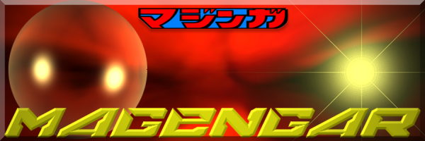
to our japanese title singer Magengar.
Of course a simple RJ logo suit better for a first tshirt.
Now you have different type of printing...
I allready tried a lot of techniques and Silkscreen is the best quality and last more.
Is there an official graphic set up and datas for RJ ?
(logo, colors, fonts...)
I can help to make something official (printable)
with pdf version ready for silkscreen or whatever...
|
|
|
|
Post by Mazinish on Sept 10, 2011 18:30:18 GMT -5
that logo IS nice, nice enough to be in a jacket? |
|
|
|
Post by OJA on Sept 10, 2011 23:43:20 GMT -5
I do like our original logo in black t-shirt. ;D  |
|
|
|
Post by Lejam on Sept 11, 2011 4:44:14 GMT -5
IMHO, flat design (simply logo with 1 ink) is better and graphic...
(and cheaper to produce....)
|
|
|
|
Post by Chen on Sept 11, 2011 8:46:29 GMT -5
I really like that logo design that lejam did but it would cost more if it was used on t-shirts and stuff. But it could be used for things like coffee mugs, magnets, and stickers.
|
|
|
|
Post by admin1 aka Ed on Sept 11, 2011 10:59:35 GMT -5
thanks OJA.... I'm not looking at the logo |
|
|
|
Post by drwily008 on Sept 12, 2011 8:54:56 GMT -5
I vote for the first of the 2 designs! I prefer the black shirt with a red logo. Count me in!
|
|