|
|
Post by greengetterguy on Jun 21, 2015 21:42:54 GMT -5
since that conversation is not stopping, i created a thread for it.
i just ask that please be civil and refrain from disrespecting other members who has a different opinion from you.
that includes using snide remarks, being passive aggressive, or just being rude.
|
|
|
|
Post by mecha-mania on Jun 21, 2015 23:02:38 GMT -5
No preference. As long as it looks good on the robot, works for me  |
|
|
|
Post by TheMazingerZ on Jun 21, 2015 23:32:51 GMT -5
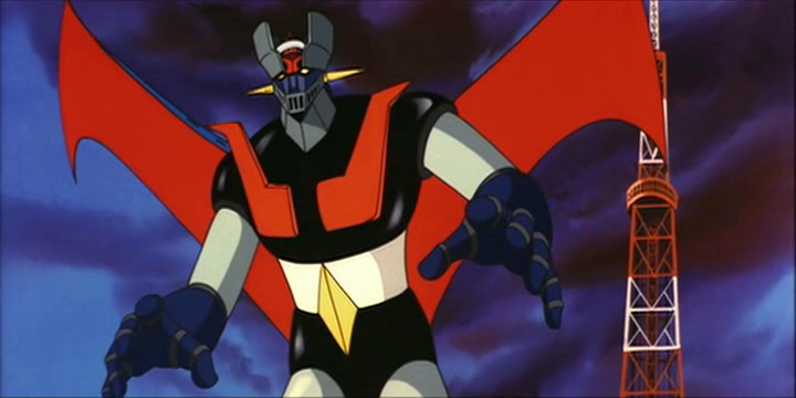
The color actually used in the anime.
}D
|
|
|
|
Post by tetsuryu on Jun 22, 2015 0:22:38 GMT -5
Depends on how much I like the rest of the paint apps.
|
|
|
|
Post by OzmaLee on Jun 22, 2015 1:58:34 GMT -5
Silver. I've been brainwashed with the Popy toys growing up.
|
|
|
|
Post by reVolVer on Jun 22, 2015 2:22:15 GMT -5
cant vote two... but DEFINITELY silver or chrome.
|
|
|
|
Post by magengar on Jun 22, 2015 3:29:04 GMT -5
I like "white" in the anime. But I voted silver for the action figure or toy... ...the Bandai vinyl Jet Jaguar nailed it right On Point. (IMO) ...so did the LeReve vinyl Mazinger figure, and the GX-45 and 49, and the SRCs, because it's all silver limbs instead of a mix-match with chrome (which turns me off). That's just my personal taste. If the toy looks good with the paint app color scheme balanced, and the collector is happy with it, then so be it. There's really no debate going on here... a lot of us like the silver app, and its popularity shows. We really don't mind the white in the anime so much, because we're so entertained by the robot character to pay attention to such detail.  Now... if the anime showed some inconsistency in the color scheme ( ie: the Maziner-Z series, with different artists on board) then "Houston, we have a problem".  zozo-mag |
|
|
|
Post by B- on Jun 22, 2015 4:06:16 GMT -5
There's really no debate going on here... a lot of us like the silver app, and its popularity shows. We really don't mind the white in the anime so much, because we're so entertained by the robot character to pay attention to such detail. Now... if the anime showed some inconsistency in the color scheme ( ie: the Maziner-Z series, with different artists on board) then "Houston, we have a problem". zozo-mag Actually there is a HUGE debate going on about this in the HLPro Z Mazinger thread and it's exactly why this thread was created lol.and a lot of us love the white ...we don't just mind it because we are entertained by the robot not to notice! We aren't children watching Saturday morning cartoons lol and even then I noticed everything.Your cutting us a bit short Magengar lol. .But ultimately as TMZ is pointing out in his reply here is what is THE actual colors not what is preferred !!!! guys and Magengar You are missing the whole intent of the thread it's ABOUT noticing everything and every detail and what the colors mean and truly are ....anime accuracy!! .. And moreover how it translates to our hobby.Maybe go back and read the stuff in the other thread that prompted this one and you'll have an idea why we are discussing this.thanks buddy. it should be pointed out for others the intent of the thread to go back and read the other one.Something got lost along the way this isn't about preference. We can talk that here now but it's not why the need for this thread was created.BTW if you haven't deducted TMZ response about what colors the limbs actually are in the anime IS his answer to the question one box I would have checked also but curiously does not appear above because again the intent has been lost somehow . |
|
|
|
Post by reVolVer on Jun 22, 2015 5:05:27 GMT -5
Just make it simple.
subject: LIMBs
anime: white
IN Toy Form: most prefer it silver (unless white wins the vote).
|
|
|
|
Post by Mechanical Flesh on Jun 22, 2015 5:35:49 GMT -5
Heh, I can't vote  because I like cartoon colors (white limbs option) just as much as metallic colors (silver option). Why? Because it's not even a "depends on the character" thought process, no.. It mostly depends on how I want to display the figure. For example, the SRC Grendizer: the upcoming one, with white-colored parts, matches its spazer so it is the best choice if you want to display the two things together. While the older version, with grey metallic parts, looks better when put next to its two SRC Mazinger brethren. See, same figure, different colors, looks better or worse depending on the situation. Although, there are many robots which only look good in one "color palette" to me, so I may go for the "depends on the character" option. One thing's for sure, I avoid chrome when possible  EDIT: another example, the HL Pro Gattaiger: I ordered the silver version, with metallic grey as the primary color. I perfectly know that it's not show-accurate, the regular version is the one sporting the cartoon colors. But I decided to go for the less accurate silver version. Why? Because, as a display figure, it's going to be more "flexible", i.e. it's gonna look good no matter who you pair it with. My idea is to pose it next to the Yamato GN-U Groizer X, which has similarly colored limb sections, it's gonna be a perfect match  |
|
|
|
Post by jaylive on Jun 22, 2015 6:22:58 GMT -5
in general I like silver better. kaiser SRC looks absolutely stunning in chrome though. and I also like white on reideen, however white looks dumb on most others I've seen though. it makes them look like cheap toys.
|
|
|
|
Post by S_Gokin on Jun 22, 2015 8:18:13 GMT -5
i want to vote for two the silver and depend on the character, because some robots wont look as good if they were painted silver like Daimos or Getter robo, also some wont look as good if they were painted white in most cases white give you a child toy feeling like the Mattel Voltron its super anime accurate in colors but it don't look that good in my opinion also silver give you the realistic look that's why they use it the most and we are not arguing for fun or troll  its just some comments are provocative by pushing opinions and personal taste as fact  come on anime accurate colors is to have the exact same colors in the anime right i agree, but for me in most cases white don't look good in real as it was in anime, im sure every one want to have a good looking collection at least for him \ her, so again its about the collector preference you want white go white and have an anime accurate collection if not go and have whatever you think is good in your eyes |
|
|
|
Post by reVolVer on Jun 22, 2015 11:00:21 GMT -5
Perhaps those robot anime gods in Japan can define what is really anime accurate by..
Anime Accurate "Color"- white, gray, etc. etc... the way it was colored in anime.. represents metal but cant use silver back then.. unless they already have the "tech" to do it in 3D animation hehehe..
Anime Accurate "Material"- silver or chrome.. also represents metal, but what it is in real life.. the reason why most toys with metal parts are colored that way.
|
|
|
|
Post by TheMazingerZ on Jun 22, 2015 11:32:05 GMT -5
Yes, it has been used in 3D CGI animation, and it looked horrible. Check out the last Reideen anime and you'll see what I mean:
}|
|
|
|
|
Post by reVolVer on Jun 22, 2015 12:02:55 GMT -5
and that was recently. what i mean was "back then".. anyway the result will be the same.. i know .. already watched that years ago.. one of those robot animes i would not bother watching again. yeah animation sucked plus the story is somewhat boring. add the fact i dont like the new outrageous "G-Pride Parade" reideen design hehehe i must admit... its unbeareable to watch. |
|
|
|
Post by faelon on Jun 22, 2015 20:00:10 GMT -5
Generally I prefer Silver. I know some insist on "Anime Accuracy", but the eye perceives things differently between a flat 2d animation cell and a 3 dimensional sculpting of the same. At days end it is whichever lends a greater weight of believability to the robot. Which makes it work visually? And honestly, you will rarely if ever get "white" on any of these, because for the most part pure white on a three dimensional object like a robot tends to look awful in hand. What seems white is a very pale blue which better fools the eye, while permitting the graduations as light plays across it that make it a believable 3d object.
Some robots look good with a white tone. Especially the 80's and 90's ish stuff like Gundams. The cleaner white works well with their boxier limbs and hard angles. I personally find that the more classic and smoothly curved robots of the 70's and early 80's tend to look better at these scales with a silver tone. It allows for a smoother and greater gradual contrast that better shows off the curves. whereas the white as I said above works best with hard angles.
Oh one other thing to keep in mind. something I have learned from many many years as a modeler and railroad modeler. Colors and how your eye perceives them shift with scale. You can't take a smaller scale model and paint it in exactly the same colors as the real world object and have it look right. For the eye as the scale is reduced or the viewing distance is increased the colors undergo a dark shift while ta the same time they lose shine and sparkle. In our case the 1:1 real workd model is how it appears in the anime. Our eyes are perceiving that as the large or towering real world object. The Chogokin however is the scale model. It is the small miniature to your eyes. So your eyes will expect it to be darker, a bit less color saturated and a lot less shiny. Failing to be that makes it look much more "toy like" if you will. This is why we often do not care for the appearence of chrome on these things. or want it limited to certain key "pop" points.
Just my opinion based on how it looks to my eyes. Your preferences may and likely will vary.
|
|
|
|
Post by droutmaster on Jun 22, 2015 20:05:51 GMT -5
depends, in anime the white works for everyone because is the most neutral color in all regards for everything from silver to chrome. But when that anime comes into reality things changes, the white works for certain characters because of the pallet colors of them. A good example Getter Robo, since he uses 2 prominent vibrant colors red and yellow then white works great with him (sometimes an off white colors like pearl white looks great on him as well) but for those like the Mazingers that use more like tone down colors like Black and Blue then in this case Silver is the best for them because white makes tehm look cheap.
Now those that are like Daimos for example that his prominent colors are red and black defenetly white is good for him to balance it out in both side.
now for chrome im not to fan of it, is best use for weapons like swords and such than anything else, if apply to the robot it looks very distracting and specially very noticeable is when they apply it random( waist silver but limbs are chrome (example SoC MZ,GM and UFOG)
|
|
|
|
Post by droutmaster on Jun 23, 2015 2:44:41 GMT -5
reposting a comment by request of S_Gokin
|
|
|
|
Post by superelectro on Jun 23, 2015 3:41:39 GMT -5
Generally I prefer Silver. I know some insist on "Anime Accuracy", but the eye perceives things differently between a flat 2d animation cell and a 3 dimensional sculpting of the same. At days end it is whichever lends a greater weight of believability to the robot. Which makes it work visually? And honestly, you will rarely if ever get "white" on any of these, because for the most part pure white on a three dimensional object like a robot tends to look awful in hand. What seems white is a very pale blue which better fools the eye, while permitting the graduations as light plays across it that make it a believable 3d object. Some robots look good with a white tone. Especially the 80's and 90's ish stuff like Gundams. The cleaner white works well with their boxier limbs and hard angles. I personally find that the more classic and smoothly curved robots of the 70's and early 80's tend to look better at these scales with a silver tone. It allows for a smoother and greater gradual contrast that better shows off the curves. whereas the white as I said above works best with hard angles. Oh one other thing to keep in mind. something I have learned from many many years as a modeler and railroad modeler. Colors and how your eye perceives them shift with scale. You can't take a smaller scale model and paint it in exactly the same colors as the real world object and have it look right. For the eye as the scale is reduced or the viewing distance is increased the colors undergo a dark shift while ta the same time they lose shine and sparkle. In our case the 1:1 real workd model is how it appears in the anime. Our eyes are perceiving that as the large or towering real world object. The Chogokin however is the scale model. It is the small miniature to your eyes. So your eyes will expect it to be darker, a bit less color saturated and a lot less shiny. Failing to be that makes it look much more "toy like" if you will. This is why we often do not care for the appearence of chrome on these things. or want it limited to certain key "pop" points. Just my opinion based on how it looks to my eyes. Your preferences may and likely will vary. Nice insight. Learned something new today. Thanks. I am not a fan of chrome unless it is for the weapons, blades or accents. |
|
|
|
Post by faelon on Jun 23, 2015 11:44:21 GMT -5
Actually partially painting large machines is very common, and was almost the order of the day in the 60's 70's and early 80's. Paint = Weight. A common fuel saving technique, especially for things that fly, is to use less paint and leave some surfaces bare metal. This is why many airlines have shiny metal planes with only partial paint markings. Many others leave the wing surfaces unpainted. Perhaps the most famous example of this was the U.S. space Shuttle, where after the first few flights the external fuel tank switched from painted white to the burnt orange color of the unpainted material.
It would not be unusual to see some robot designs of this period follow this aesthetic. We certainly see it in the Tokutatsu (sp?) / Kaiju shows. Now whether The Mazinger's were intended this way? Who knows. But do take not that the "bare metal" SOC version of Tetsujin 28 is probably the best looking and most visually believable take on the robot. The eye expects it to be a big hulking metal beast. Not a fancy painted sports car.
|
|