|
|
Post by Gettershadow on Oct 8, 2013 17:40:41 GMT -5
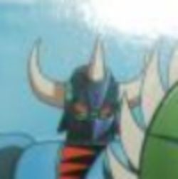
dude, go watch that episode again. Gin Gin was drawn all across the board, he never quite looks the same in each shot.. you can sculpt him that way with just about any feature you want. The horn is forward AND backwards.. the eyes are all different shapes and sizes every time they show him..
|
|
|
|
Post by Gettershadow on Oct 8, 2013 20:40:50 GMT -5
HLPro said it goes forward on the Original character sheet by Go Nagai so that's what they used. and in the anime it goes either way.. they also said you can freeze the frames and see any shape eye you want, big or small round or whatever...and the saw blades on the shields point up or down just whatever.
They are saying that based on original drawings they have by Dynamic Planning, Go Nagai usually had the horn going forward in his original drawings so that's what they used.
|
|
|
|
Post by Gettershadow on Oct 8, 2013 20:52:09 GMT -5
|
|
|
|
Post by Gettershadow on Oct 8, 2013 20:53:44 GMT -5
|
|
|
|
Post by Gettershadow on Oct 8, 2013 20:56:56 GMT -5
|
|
|
|
Post by Gettershadow on Oct 8, 2013 21:13:29 GMT -5
Hlpro explains that in 70s anime, whenever a figure has some kind of "curve" like a horn or something, it almost always curves toward the viewer and sometimes it would go to one side or the other to give a sense of motion and what not , its weird but you have to study the stuff frame by frame to see how they did things .. and the drawings to make the series were being drawn in Japan, Korea and Taiwan by big teams of guys so inconsistency sometimes happened. But based on original Go Nagai drawings and intense study of the character, the horn is supposed to be FORWARD. This was verified by Dynamic Planning.. they had the same question and checked it out before hand.. it goes FORWARD (or was supposed to )
He also said "Dynamic Planning said it goes forward, Toei sometimes showed it going backward".. either way they didn't care much.. this was a long time before Japanese 70s Robot collectors. ha ha
|
|
|
|
Post by Ross McCollector on Oct 8, 2013 21:17:02 GMT -5
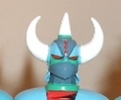
Dude here are the pics...notice how perfect their box art, and how the eyes and horns are different in the actual figure. Box art (took it from Baron, not too clear but you get the idea)  The actual figure: side horns too thick and the middle horn comes straight from the top, and eyes are too thin like a cat  They should have at least followed their box art |
|
|
|
Post by Gettershadow on Oct 8, 2013 21:25:34 GMT -5
only difference is the shadows.. your eyes are playing tricks on you. Looks good either way.. youre trippin
|
|
|
|
Post by Ross McCollector on Oct 8, 2013 21:29:11 GMT -5
The horns I can live with, but saying that the eyes are not small, then you are the one that your eyes playing tricks on you. Check your own pics that you posted.
|
|
|
|
Post by Gettershadow on Oct 8, 2013 21:40:09 GMT -5
Gin Gin was not a mechanical drawing. He looked different every time they showed him. The eyes the Horns all of that was different each time bc it was all hand drawn in the 70s and they were trying to express motion and emotion. His eyes were small, his eyes were big and the horns were just all over the place.. it was just a cartoon and it was being drawn by different guys in different countries real quickly.. they didn't put that much thought into it at the time. Toei pretty much used artistic license when they were drawing it at the time.. using Dynamic Plannings drawings as a guide..
|
|
|
|
Post by Gettershadow on Oct 8, 2013 21:43:48 GMT -5
Let me ask you this Ross, what about that SRC Grendizer? What do you think of that one?
|
|
|
|
Post by Ross McCollector on Oct 8, 2013 21:54:07 GMT -5
Gin Gin was not a mechanical drawing. He looked different every time they showed him. The eyes the Horns all of that was different each time bc it was all hand drawn in the 70s and they were trying to express motion and emotion. His eyes were small, his eyes were big and the horns were just all over the place.. it was just a cartoon and it was being drawn by different guys in different countries real quickly.. they didn't put that much thought into it at the time. Toei pretty much used artistic license when they were drawing it at the time.. using Dynamic Plannings drawings as a guide.. I agree, and that goes to every single 70s Robots since they were all drawn differently by different artists and they were never consistent BUT that being said there is an "agreed" look to these Robots that we can tell when there is something off about the figure....Their box art is always top notch, but when it comes to the HS not so much. This HS with the cat eyes looks way modernized and it totally goes against all the stuff that you have been saying about them want to keep it "classic". I'm still keeping Gin Gin, and I know it's gonna be a nice addition to my collection, but I'll mention the good and the bad about the figure. |
|
|
|
Post by Ross McCollector on Oct 8, 2013 21:58:52 GMT -5
Let me ask you this Ross, what about that SRC Grendizer? What do you think of that one? Funny you ask cause I was gonna bring it up in the argument of cat eyes....it doesn't look accurate, especially the HS..but I knew exactly what I was getting and since I'm huge Grendizer fan, I looked at it in a different way..more modern way. I know few that HATED it, but the end of the day it's another interpretation of it and it compliment the SRC line. |
|
|
|
Post by Buster_One on Oct 8, 2013 22:10:22 GMT -5
 They should have at least followed their box art From this angle the center horn looks like someone put ice cream cone on his head. I think it would look better if the center horn was positioned more forward towards forehead a little bit. Yes gin gin is a nice figure but just pointing out what looks odd to me. |
|
|
|
Post by Gettershadow on Oct 8, 2013 22:12:34 GMT -5
right well, I think those thighs are too big.. I don't believe in "Shin Grendizer" but any company can do whatever they want with a character once they buy the rights to it.. there is no real "correct" way to do any of this, its ART.. that's why if HLpro wants to put a "sinister" facial expression on Gin Gin, its still a "correct" Gin Gin and in the sprit of the original character.. Because Gin Gin was drawn with different facial expression on him.. we have the screen shots to prove it too. Some guys want a character to look the way they think they see it or want it to be.. I understand that. But everything Hlpro did with that figure can be back up with Go Nagai drawings.. and they have those drawings to prove it too!
|
|
|
|
Post by Gettershadow on Oct 8, 2013 22:14:20 GMT -5
 They should have at least followed their box art From this angle the center horn looks like someone put ice cream cone on his head. I think it would look better if the center horn was positioned more forward towards forehead a little bit. Yes gin gin is a nice figure but just pointing out what looks odd to me. his chin is up, put his chin down and it would do as you say.. photos are not enough.. you have to get the figure in your hands first |
|
|
|
Post by Ross McCollector on Oct 8, 2013 22:33:35 GMT -5
We can argue all night about what's ART and what is the correct interpretation, but to be honest you are not gonna change my mind, and I'm sure I'll never change yours for obvious reasons.
|
|
|
|
Post by Gettershadow on Oct 8, 2013 22:46:11 GMT -5
we will see him better tomorrow when I get mine Ill do a full video review on him..
I just don't like the double standard, the Grendy SRC is done is a way that Grendizer was never drawn.. but if HLpro puts squinty eyes on Gin Gin "its not correct".. knock it off, man.. that's Asperger's right there. heh
|
|
|
|
Post by Ross McCollector on Oct 8, 2013 23:00:02 GMT -5
Like I said my opinion SRC Grendy is the same as my opinion on Gin Gin when it comes to the eyes. I'm being harder on HLPRO cause their whole goal according to you is to make them look "classic". Can I ask you something Tom? Can you please include Pros and CONS in your video review? Thanks man and Good night  |
|
|
|
Post by Gettershadow on Oct 9, 2013 9:22:34 GMT -5
I cant say any more to you dude, Im a grown man and Im not going argue about toy Robots..
From the photos Ive seen so far, looks like HLpro did a good job of making a Gin Gin that has a classic look to it. I will know more when mine comes in.. It should be in today. Ill give a fair review, all my reviews are fair.. even in my motorcycle reviews I mention that there are two sides to every coin. Every weakness is also a strength and every strength comes at a price.
|
|