|
|
Post by DUKE 77 on Nov 27, 2013 3:30:37 GMT -5
Head is off,shoulders off Im sure of it. but what are you comparing it to? ... the custom figure of Gattiger based on Energer? the anime version doesn't really have "shoulders" just some .... things The anime version looks way better! Dictator Jammy loves to stretch the figures (now their faces too) cuz it is an European style that "he" likes, which doesn't work for Japan robots. Could you please stop playing the role of his defender lawyer here just cuz he is sending you FREE or low-priced samples? We All know this, so, really please stop it. This man and his company's attitude suck BIG TIME. STOP! |
|
|
|
Post by chogokinabdul on Nov 27, 2013 3:31:55 GMT -5
They did the same to my older account and banned me cause I politely asked them if they were going to release the new MT01 head sculpt separate for the people that were stuck with the 1st one!!! They are very arrogant and unprofessional...typical French lool (They)? There is no "they".  You mean "he". The pathetic toy maker CEO who thinks he can do whatever he wants disfiguring our beloved characters as he wants. Did you see the ugly 2m Grendizer he is releasing? And why is Duke Fleed running on the hand of Grendizer, (statue)? Anyway, since this is a MT thread, let us hope Mr. Sick will stop stretching our characters, he is just a manufacturer not a creator of any. P.S. Some should tell him to slow down with using the  icon. It doesn't suit his age and it's not an excuse for his cheesy aggression with human beings. what statue with duke running? do you have a link of that dammage? |
|
|
|
Post by B- on Nov 27, 2013 6:23:41 GMT -5
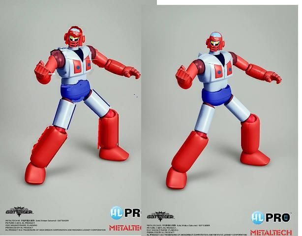
Im comparing it to the other parts of the toy,just anatomically speaking as an artist its not rightChest is too wide for the figures in ratio to the other body parts,head is not proportionate,and the top hat part is off as well as eyes part,just wonky.Nothing to do Tom with how its drawn differently really,its just off proportionately a bit.But I really welcome this fgigure otherwise!Bravo HLPro for making it.
|
|
|
|
Post by Chen on Nov 27, 2013 7:36:46 GMT -5
Ok before this get's out of hand, NO PERSONAL ATTACKS! These are toys, everyone's opinion is should be respected but try and post it in a respectful manner. Disrespect will NOT be tolerated.
|
|
|
|
Post by gravewolf on Nov 27, 2013 11:40:10 GMT -5
To be fair there's only one anime of gattaiger and it's kinda hard to get the right proportions to him since 70's anime's tend to have bad proportions when a character is shown in different perspectives. And I'll be honest in saying that I'm not really feeling the design of the character compared to Grendy. I'm actually shocked that and feel ashamed that I didn't know of him till now and I've watched a lot of robot anime since the early 80's. Though I'll have to give it to hlpro for making a figure of him.
|
|
|
|
Post by Gettershadow on Nov 27, 2013 12:02:20 GMT -5
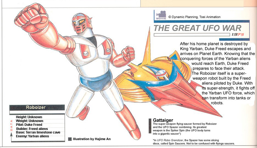
Im comparing it to the other parts of the toy,just anatomically speaking as an artist its not rightChest is too wide for the figures in ratio to the other body parts,head is not proportionate,and the top hat part is off as well as eyes part,just wonky.Nothing to do Tom with how its drawn differently really,its just off proportionately a bit.But I really welcome this fgigure otherwise!Bravo HLPro for making it. Baron I respect your judgement, you've got a lot of experience and figures under your belt but go back and look at those few seconds of footage in the OVA.... you don't get to see Gattiger for more than a few times and hes not dawn with a whole lot of detail by todays standards.. and when you see him during docking and undocking, he isn't much to look at... and when hes standing hes got real slumped shoulders, Gattiger wasn't a real "good looking" character to begin with. That one photo of the uncolored prototype with him just standing in a static pose... that looks about right to me, not exact of course bc that would be impossible but it does look like Gattiger. I was shown some other photos of the hands and shoulders... the open hands DO MATCH when you see them from other angles .. they are built on the same 3D model. |
|
|
|
Post by Chen on Nov 27, 2013 16:31:35 GMT -5
I've deleted ALL posts that have nothing to do with the actual toys, no posts about race or personal attacks will be tolerated. One warning only. Keep the thread on topic.
|
|
|
|
Post by Gettershadow on Nov 27, 2013 16:35:29 GMT -5
sure thing... thanks Chen
all "Qutoes" from that episode also deleted out of respect for Robot Japan..
|
|
|
|
Post by kaeruze on Nov 27, 2013 16:43:40 GMT -5
|
|
|
|
Post by DUKE 77 on Nov 27, 2013 17:09:19 GMT -5
Im comparing it to the other parts of the toy,just anatomically speaking as an artist its not rightChest is too wide for the figures in ratio to the other body parts,head is not proportionate,and the top hat part is off as well as eyes part,just wonky.Nothing to do Tom with how its drawn differently really,its just off proportionately a bit.But I really welcome this fgigure otherwise!Bravo HLPro for making it. You see how did you talk about the toy? It's almost the same I said about it. I just said I think its head is stretched but overall it looks nice. Imagine if you get banned for just saying your point of view in a polite way to a company you spent lots of money buying its stuff. Don't tell me you won't feel offended. Plus, without the collectors' (us) opinions how they are gonna improve their products if they only listen to their own voice? Oh, why I am saying "they"...I should say "he". And add the cheesy  tongue smiley as an excuse for being cheesy! Do you understand my point? It's not personal. It's professional. We are not only talking about toys here but the money we pay for them, and the policies of the companies making them. Again, I am asking you, how would you feel being banned just for the post you just made?  |
|
|
|
Post by droutmaster on Nov 27, 2013 17:15:58 GMT -5
To be fair there's only one anime of gattaiger and it's kinda hard to get the right proportions to him since 70's anime's tend to have bad proportions when a character is shown in different perspectives. And I'll be honest in saying that I'm not really feeling the design of the character compared to Grendy. I'm actually shocked that and feel ashamed that I didn't know of him till now and I've watched a lot of robot anime since the early 80's. Though I'll have to give it to hlpro for making a figure of him. Totally agree, Gattaiger's proportion changes so much is truly inconsistent. Even the Mazinger bible and the SRE 2008 book also shows its proportion not matching at all to what we see in the promo movie. then again he was just that, a promo video. |
|
|
|
Post by B- on Nov 27, 2013 17:18:19 GMT -5
real FAST QUICK FIXES,JUST MOLDING IT ALONG,LOOKS BETTER WITH A BIT LARGER HEAD AND TOP WINDOW OF HEAD CRUSHED DOWN SOME,MAKES CHEST LOOK MORE PROPRTIONATE,WIDENED LEGS ETC ETC..VERY QUICKLY DONE IN PAINT BUT YOU SEE WHAT I MEAN AT LEAST.crap capitals sorry..had caps stuck on sorry for yelling.  |
|
|
|
Post by Gettershadow on Nov 27, 2013 17:18:53 GMT -5
is there anyway to post a photo from my own photos in my own computer files.. looks like photos can only be links..
I got some photos I want to show but its not easy to do on RJ
|
|
|
|
Post by B- on Nov 27, 2013 17:20:33 GMT -5
you need to download them with photobucket,just did that with my above example.
|
|
|
|
Post by Gettershadow on Nov 27, 2013 17:23:26 GMT -5
|
|
|
|
Post by B- on Nov 27, 2013 17:26:44 GMT -5
|
|
|
|
Post by B- on Nov 27, 2013 17:27:56 GMT -5
You just need to right click,copy URL and click here on the photo link icon and paste it in.Dont need photobucket for that.
|
|
|
|
Post by droutmaster on Nov 27, 2013 17:29:10 GMT -5
 that image? that is fromt the SRE 2008 book. there is also another pic of Gattaiger on that same book that has more of a human proportions on the limbs. |
|
|
|
Post by B- on Nov 27, 2013 17:33:49 GMT -5
Does anyone agree with my mock up?At least as far as teh head goes?
|
|
|
|
Post by droutmaster on Nov 27, 2013 17:36:36 GMT -5
Does anyone agree with my mock up?At least as far as teh head goes? real FAST QUICK FIXES,JUST MOLDING IT ALONG,LOOKS BETTER WITH A BIT LARGER HEAD AND TOP WINDOW OF HEAD CRUSHED DOWN SOME,MAKES CHEST LOOK MORE PROPRTIONATE,WIDENED LEGS ETC ETC..VERY QUICKLY DONE IN PAINT BUT YOU SEE WHAT I MEAN AT LEAST.crap capitals sorry..had caps stuck on sorry for yelling.  hmm red top on gattaiger heads just need to be reduce a little bit, interestingly Gattaiger in body wise his suppose to be more wider. |
|